
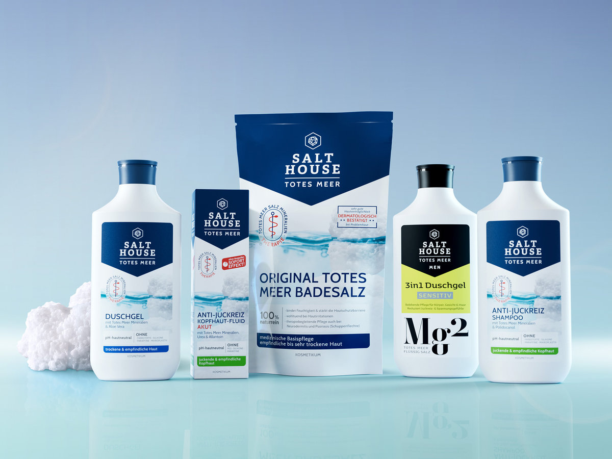
Recyclingfähige Kosmetik-Flasche für Hautpflege-Marke Salthouse.
Recyclable cosmetics bottle for the Salthouse skincare brand.
Einreicher: Brandpack GmbH (Andreas Schabert, Arne Fehlhaber, Florian Schaake, Christine Salzbrunn, Bianca Friedrich, Leonie Strecker)
Land: Deutschland
Material: Kunststoff (starr)
Die Einreichung ist bereits auf dem Markt.
Die Jury sagt:
Die Verpackung für die therapeutischen Hautpflegeprodukte von SALTHOUSE überzeugt als ganzheitliche Designlösung, die Markenidentität, Funktionalität und Nachhaltigkeit konsequent miteinander verbindet. Der fließende Übergang von Flaschenschulter und Deckel, inspiriert von der Form traditioneller Tongefäße, schafft eine unverwechselbare Silhouette mit hohem Wiedererkennungswert und differenziert die Marke deutlich im Wettbewerbsumfeld.
Gegenüber der bisherigen Verpackung wurde das Konzept in allen wesentlichen Bereichen weiterentwickelt. Der bewusst abgesetzte Deckel verbessert die Ergonomie und ermöglicht ein intuitives, komfortables Öffnen. Gleichzeitig wurde die Konstruktion funktional optimiert: Die Flasche lässt sich für eine nahezu vollständige Restentleerung kopfüber aufstellen und der Wechsel auf einen Schraubverschluss unterstützt die Wiederbefüllbarkeit.
Auch hinsichtlich Materialwahl und Nachhaltigkeit stellt die Verpackung einen deutlichen Fortschritt dar. Die konsequent recyclinggerechte Auslegung aller Komponenten nach Design-for-Recycling-Prinzipien sowie der reduzierte Materialeinsatz zeigen, dass ökologische Anforderungen nicht als Einschränkung verstanden wurden, sondern als integraler Bestandteil des Designprozesses. So entsteht eine Verpackung, die gestalterisch eigenständig, funktional durchdacht und technisch wie nachhaltig überzeugend umgesetzt ist.
What the jury said:
The packaging for SALTHOUSE’s therapeutic skincare products stands out as a holistic design solution that consistently combines brand identity, functionality and sustainability. The seamless transition from the bottle’s shoulder to the cap, inspired by the shape of traditional earthenware vessels, creates a distinctive silhouette with high recognition value and clearly sets the brand apart from the competition.
The packaging design has been further developed in all key areas compared with the previous version. The deliberately offset cap improves ergonomics and allows for intuitive, convenient opening. At the same time, the design has been functionally improved. The bottle can be stood upside down to empty almost all remaining contents, and the switch to a screw cap makes it easier to refill.
The packaging also represents a significant step forward in terms of material selection and sustainability. The consistent design of all components to be suitable for recycling, in line with “design for recycling” principles, as well as the reduced use of materials, demonstrate that environmental considerations were not viewed as a constraint, but as an integral part of the design process. The result is packaging that is distinctive in its design, functionally well thought-out and effectively implemented both technically and in terms of sustainability.
Submitted by: Brandpack GmbH (Andreas Schabert, Arne Fehlhaber, Florian Schaake, Christine Salzbrunn, Bianca Friedrich, Leonie Strecker)
Country: Germany
Material: Plastic (rigid)
The submission is already on the market.